Tuesday 26 March 2013

Introducing JSON


JSON (JavaScript Object Notation) is a lightweight data-interchange format. It is easy for humans to read and write. It is easy for machines to parse and generate. It is based on a subset of the JavaScript Programming Language, Standard ECMA-262 3rd Edition - December 1999. JSON is a text format that is completely language independent but uses conventions that are familiar to programmers of the C-family of languages, including C, C++, C#, Java, JavaScript, Perl, Python, and many others. These properties make JSON an ideal data-interchange language.
JSON is built on two structures:
  • A collection of name/value pairs. In various languages, this is realized as an object, record, struct, dictionary, hash table, keyed list, or associative array.
  • An ordered list of values. In most languages, this is realized as an array, vector, list, or sequence.
These are universal data structures. Virtually all modern programming languages support them in one form or another. It makes sense that a data format that is interchangeable with programming languages also be based on these structures.
In JSON, they take on these forms:
An object is an unordered set of name/value pairs. An object begins with { (left brace) and ends with } (right brace). Each name is followed by: (colon) and the name/value pairs are separated by , (comma).

An array is an ordered collection of values. An array begins with [ (left bracket) and ends with ] (right bracket). Values are separated by, (comma).

value can be a string in double quotes, or a number, or true or false or null, or an object or an array. These structures can be nested.

string is a sequence of zero or more Unicode characters, wrapped in double quotes, using backslash escapes. A character is represented as a single character string. A string is very much like a C or Java string.

number is very much like a C or Java number, except that the octal and hexadecimal formats are not used.

Whitespace can be inserted between any pair of tokens. Excepting a few encoding details, that completely describes the language.

Monday 25 March 2013

How to Create usercontrol in WPF


preview

Introduction

This article shows you how we can create a User Control in WPF and how we can use it in our WPF applications. In this article, I'll show you how we can create a custom ToolTip in WPF with VS2008 SP1 & C#.

Background

There are similar articles like this, for example, see this article that was written by Sacha Barber.

Using the Code


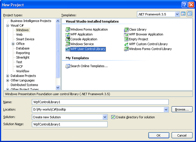
There we go. First we should create a User Control. Thus we have to select WPF User Control Library Project.
Custom User Control in WPF
Now, we can create or edit the XAML code for creating a custom user control. I've used this XAML code for a custom tooltip. It's up to you what you want.
<UserControl 
    Name="UserControlToolTip"
    x:Class="CustomToolTip.UserControl1"
    xmlns="http://schemas.microsoft.com/winfx/2006/xaml/presentation"
    xmlns:x="http://schemas.microsoft.com/winfx/2006/xaml"
    xmlns:d="http://schemas.microsoft.com/expression/blend/2008" 
    xmlns:mc="http://schemas.openxmlformats.org/markup-compatibility/2006" 
    mc:Ignorable="d" RenderTransformOrigin="0,0" HorizontalAlignment="Left" 
 VerticalAlignment="Top" >
    
    <UserControl.RenderTransform>
        <TransformGroup>
            <ScaleTransform ScaleX="1" ScaleY="1"/>
            <SkewTransform AngleX="0" AngleY="0"/>
            <RotateTransform Angle="0"/>
            <TranslateTransform x:Name="UserControlToolTipXY" X="0" Y="0"/>
        </TransformGroup>
    </UserControl.RenderTransform>
    
    <Grid HorizontalAlignment="Center" VerticalAlignment="Center" 
 MinWidth="200" MinHeight="120">
     <Grid.RowDefinitions>
      <RowDefinition Height="0.333*"/>
      <RowDefinition Height="0.667*"/>
     </Grid.RowDefinitions>
        <Rectangle Fill="#FFFBFBFB" Stroke="#FF000000" RadiusX="10" RadiusY="10"
          RenderTransformOrigin="0.139,0.012" StrokeThickness="1" Grid.RowSpan="2">
            <Rectangle.BitmapEffect>
                <DropShadowBitmapEffect Opacity="0.8"/>
            </Rectangle.BitmapEffect>
        </Rectangle>
        <Rectangle RadiusX="10" RadiusY="10" RenderTransformOrigin="0.139,0.012" 
         StrokeThickness="10" Stroke="{x:Null}" 
 Margin="1,1,1,1" Grid.Row="0" Grid.RowSpan="2">
         <Rectangle.Fill>
          <LinearGradientBrush EndPoint="0.5,1" StartPoint="0.5,0.725">
           <GradientStop Color="#00E6D9AA" Offset="0.487"/>
           <GradientStop Color="#FFE6D9AA" Offset="0.996"/>
          </LinearGradientBrush>
         </Rectangle.Fill>
        </Rectangle>
        <Rectangle RadiusX="10" RadiusY="10" RenderTransformOrigin="0.493,0.485" 
         StrokeThickness="10" Stroke="{x:Null}" Grid.RowSpan="2" Margin="1,1,1,1">
         <Rectangle.Fill>
          <LinearGradientBrush EndPoint="0.014,0.5" StartPoint="0.211,0.5">
           <GradientStop Color="#00E6D9AA" Offset="0.513"/>
           <GradientStop Color="#FFE6D9AA" Offset="0.996"/>
          </LinearGradientBrush>
         </Rectangle.Fill>
        </Rectangle>
        <Rectangle RadiusX="10" RadiusY="10" RenderTransformOrigin="0.493,0.485" 
         StrokeThickness="10" Stroke="{x:Null}" Grid.RowSpan="2" Margin="1,1,1,1">
         <Rectangle.Fill>
          <LinearGradientBrush EndPoint="0.493,0.002" StartPoint="0.493,0.33">
           <GradientStop Color="#00E6D9AA" Offset="0.513"/>
           <GradientStop Color="#FFE6D9AA" Offset="0.996"/>
          </LinearGradientBrush>
         </Rectangle.Fill>
        </Rectangle>
        <Rectangle RadiusX="10" RadiusY="10" RenderTransformOrigin="0.493,0.485" 
         StrokeThickness="10" Stroke="{x:Null}" Grid.RowSpan="2" Margin="1,1,1,1">
         <Rectangle.Fill>
          <LinearGradientBrush EndPoint="0.99,0.441" StartPoint="0.794,0.441">
           <GradientStop Color="#00E6D9AA" Offset="0.513"/>
           <GradientStop Color="#FFE6D9AA" Offset="0.996"/>
          </LinearGradientBrush>
         </Rectangle.Fill>
        </Rectangle>
        <TextBlock Text="TextBlock" TextWrapping="Wrap" x:Name="TextBlockToolTip" 
         RenderTransformOrigin="0.5,0.5" Grid.Row="1" HorizontalAlignment="Left" 
             VerticalAlignment="Center" Margin="20,0,0,20" />
        <TextBlock Name="ToolTipTitle" HorizontalAlignment="Stretch" Margin="15,16,15,6.1" 
         FontSize="14" Text="title" d:LayoutOverrides="Height" />
    </Grid>
</UserControl>
Also, I've added these methods and properties for controlling the elements:
namespace CustomToolTip
{
    public partial class UserControl1 : UserControl
    {
        public UserControl1()
        {
            InitializeComponent();
        }

        public double UserControlToolTipX
        {
            get { return this.UserControlToolTipXY.X; }
            set { this.UserControlToolTipXY.X = value; }
        }

        public double UserControlToolTipY
        {
            get { return this.UserControlToolTipXY.Y; }
            set { this.UserControlToolTipXY.Y = value; }
        }

        public string UserControlTextBlockToolTip
        {
            get { return TextBlockToolTip.Text; }
            set { TextBlockToolTip.Text = value; }
        }

        public string UserControlToolTipTitle
        {
            get { return ToolTipTitle.Text; }
            set { ToolTipTitle.Text = value; }
        }
    }
}
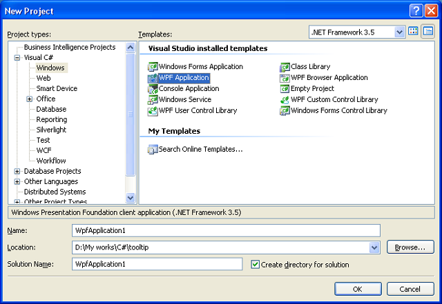
After that, press Shift + F6 for building the DLL file. Now we can create a WPF application and use our custom user control in it. Thus, we should choose a WPF Application Project.
WPF APP
Then, we have to add our User Control DLL file in the references.
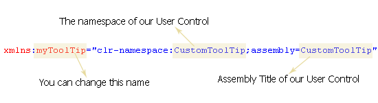
We are going to use the custom User Control within a XAML window. So we have to add an extra XAML code. We have to add the following line within Window element:
user control XAML
At last, we must have a Window tag in our XAML code like this:
<Window x:Class="WpfApplication1.Window1"
    xmlns="http://schemas.microsoft.com/winfx/2006/xaml/presentation"
    xmlns:x="http://schemas.microsoft.com/winfx/2006/xaml"
    xmlns:myToolTip="clr-namespace:CustomToolTip;assembly=CustomToolTip"
    Title="Window1" Height="600" Width="800">
</Window>
OK, now we can use the User Control in the XAML code with XAML code like this:
user control XAML
At last, I've created this XAML code:
<Window x:Class="WpfApplication1.Window1"
    xmlns="http://schemas.microsoft.com/winfx/2006/xaml/presentation"
    xmlns:x="http://schemas.microsoft.com/winfx/2006/xaml"
    xmlns:myToolTip="clr-namespace:CustomToolTip;assembly=CustomToolTip"
    Title="Window1" Height="600" Width="800">
    <Grid x:Name="rootGrid" RenderTransformOrigin="0.5,0.5">
     <Grid.RenderTransform>
      <TransformGroup>
       <ScaleTransform ScaleX="1" ScaleY="1"/>
       <SkewTransform AngleX="0" AngleY="0"/>
       <RotateTransform Angle="0"/>
       <TranslateTransform x:Name="rootGridXY" X="0" Y="0"/>
      </TransformGroup>
     </Grid.RenderTransform>
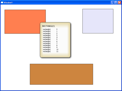
        <Rectangle Margin="26,34,496,374" Name="rectangle1" Stroke="Black" 
                   Fill="Coral" MouseLeave="rectangle_MouseLeave" 
  MouseMove="rectangle_MouseMove" />
        <Rectangle Fill="Lavender" Margin="537,29,53,376" Name="rectangle2" 
                   Stroke="Black" MouseMove="rectangle_MouseMove" 
  MouseLeave="rectangle_MouseLeave" />
        <Rectangle Fill="Peru" Margin="192,391,186,37.995" Name="rectangle3" 
                   Stroke="Black" MouseMove="rectangle_MouseMove" 
  MouseLeave="rectangle_MouseLeave" />
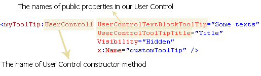
        <myToolTip:UserControl1 UserControlTextBlockToolTip="Some texts" 
                                UserControlToolTipTitle="Title" 
                                Visibility="Hidden" 
                                x:Name="customToolTip" />
    </Grid>
</Window>
And these are the methods for showing or hiding our custom ToolTip:
namespace WpfApplication1
{
    /// <summary>
    /// Interaction logic for Window1.xaml
    /// </summary>
    public partial class Window1 : Window
    {
        public Window1()
        {
            InitializeComponent();
        }

        private void rectangle_MouseLeave(object sender, MouseEventArgs e)
        {
            state = true;
            customToolTip.Visibility = Visibility.Hidden;
        }

        bool state = true;
        Random rand = new Random(DateTime.Now.Millisecond);

        private void rectangle_MouseMove(object sender, MouseEventArgs e)
        {
            if (state)
            {
                customToolTip.Visibility = Visibility.Visible;
                customToolTip.UserControlToolTipTitle = 
   (sender as Rectangle).Name.ToUpperInvariant();
                customToolTip.UserControlTextBlockToolTip = "";
                for (int i = 0; i < rand.Next(1, 30); i++)
                    customToolTip.UserControlTextBlockToolTip += (sender as Rectangle).Name 
                     + "\t" + i.ToString() + "\n";
            }
            customToolTip.UserControlToolTipX = Mouse.GetPosition(this).X + 10;
            customToolTip.UserControlToolTipY = Mouse.GetPosition(this).Y + 10;
            state = false;
        }
    }
}

That's all.


Monday 18 March 2013

jQuery Image Slideshow Gallery


Introduction:

In this article I will explain how to create lightbox image slideshow in asp.net using JQuery.


Description: 
   
In previous post I explained about jquery-slideup-slidedown-slidetoggle. Now in this article I will explain how to create lightbox image slideshow in asp.net using JQuery. In many websites generally we will see different types of slideshows like whenever we click on image that is automatically open with lightbox effect and we have a chance to see all the remaining images by press next or previous options in slideshow. All these Slideshows are implemented by using JQuery plugins. After seen those slideshows I decided to write post to use JQuery plugins to implement beautiful slideshown in asp.net. 


         To implement this one I am using  previous post insert and display images from folder based on imagepath in database because in that post I explained clearly how to insert images into our project folder and insert images path into database and display images in gridview from images folder based on Images path in database.
To implement slideshow concept first design table in your database as shown below


Column Name
Data Type
Allow Nulls
ID
int(set identity property=true)
No
ImageName
varchar(50)
Yes
Description
nvarchar(max)
Yes


After completion of table creation Open Visual Studio and create new website after that right click on your website and add new folder and give name as SlideImages because here I used same name for my sample if you want to change folder name then you need to change the Slideimages folder name in your code behind also after that write the following code in your aspx page  


<html xmlns="http://www.w3.org/1999/xhtml">
<head id="Head1" runat="server">
<title>Display Images Slideshow in asp.net using JQuery</title>
<link rel="stylesheet" href="lightbox.css" type="text/css" media="screen" />
<script type="text/javascript" src="prototype.js"></script>
<script type="text/javascript" src="scriptaculous.js?load=effects"></script>
<script type="text/javascript" src="lightbox.js"></script>
</head>
<body>
<form id="form1" runat="server">
<div>
<table align="center">
<tr>
<td colspan="2" height="200"></td>
</tr>
<tr>
<td>
Upload Image:
</td>
<td>
<asp:FileUpload ID="fileuploadimages" runat="server" />
</td>
</tr>
<tr>
<td>
Enter Image Desc:
</td>
<td>
<asp:TextBox ID="txtDesc" runat="server"></asp:TextBox>
</td>
</tr>
<tr>
<td>
</td>
<td>
<asp:Button ID="btnSubmit" runat="server" Text="Submit" onclick="btnSubmit_Click" />
</td>
</tr>
<tr>
<td colspan="2">
<asp:DataList ID="dlImages" runat="server" RepeatColumns="3" CellPadding="5">
<ItemTemplate>
<a id="imageLink" href='<%# Eval("ImageName","~/SlideImages/{0}") %>' title='<%#Eval("Description") %>' rel="lightbox[Brussels]" runat="server" >
<asp:Image ID="Image1" ImageUrl='<%# Bind("ImageName", "~/SlideImages/{0}") %>' runat="server" Width="112" Height="84" />
</a>
</ItemTemplate>
<ItemStyle BorderColor="Brown" BorderStyle="dotted" BorderWidth="3px" HorizontalAlign="Center"
VerticalAlign="Bottom" />
</asp:DataList>
</td>
</tr>
</table>
<br />
</div>
</form>
</body>
</html>
If you observe above code in header section I added some of script files and css file by using those files we will get lightbox effect slideshow. To get those files download attached sample code and use it in your application.

Another thing here we need to know is href link

<a href='<%# Eval("ImageName","~/SlideImages/{0}") %>' id="imageLink" title='<%#Eval("Description") %>' rel="lightbox[Brussels]" runat="server" >
In above tag I added rel="lightbox" this tag is used to active lightbox title this attribute is used to display image caption. If we have set of related images to group we need to include group name in between square brackets in rel attribute like rel="lightbox[Brussels]"

After completion of aspx page design add following namespaces in code behind 

C# Code

using System;
using System.Data;
using System.Data.SqlClient;
using System.IO;
After add namespace write the following code


SqlConnection con = new SqlConnection("Data Source=HanuTechVision;Initial Catalog=MySampleDB;Integrated Security=true");
protected void Page_Load(object sender, EventArgs e)
{
if(!IsPostBack)
{
BindDataList();
}
}
protected void BindDataList()
{
con.Open();
//Query to get ImagesName and Description from database
SqlCommand command = new SqlCommand("SELECT ImageName,Description from SlideShowTable", con);
SqlDataAdapter da = new SqlDataAdapter(command);
DataTable dt = new DataTable();
da.Fill(dt);
dlImages.DataSource = dt;
dlImages.DataBind();
con.Close();
}

protected void btnSubmit_Click(object sender, EventArgs e)
{
//Get Filename from fileupload control
string filename = Path.GetFileName(fileuploadimages.PostedFile.FileName);
//Save images into SlideImages folder
fileuploadimages.SaveAs(Server.MapPath("SlideImages/" + filename));
//Open the database connection
con.Open();
//Query to insert images name and Description into database
SqlCommand cmd = new SqlCommand("Insert into SlideShowTable(ImageName,Description) values(@ImageName,@Description)", con);
//Passing parameters to query
cmd.Parameters.AddWithValue("@ImageName", filename);
cmd.Parameters.AddWithValue("@Description", txtDesc.Text);
cmd.ExecuteNonQuery();
//Close dbconnection
con.Close();
txtDesc.Text = string.Empty;
BindDataList();
}

VB.NET Code

Imports System.Data
Imports System.Data.SqlClient
Imports System.IO

Partial Class _Default
Inherits System.Web.UI.Page
Private con As New SqlConnection("Data Source=HanuTechVision;Initial Catalog=MySampleDB;Integrated Security=true")
Protected Sub Page_Load(ByVal sender As Object, ByVal e As EventArgs) Handles Me.Load
If Not IsPostBack Then
BindDataList()
End If
End Sub
Protected Sub BindDataList()
con.Open()
'Query to get ImagesName and Description from database
Dim command As New SqlCommand("SELECT ImageName,Description from SlideShowTable", con)
Dim da As New SqlDataAdapter(command)
Dim dt As New DataTable()
da.Fill(dt)
dlImages.DataSource = dt
dlImages.DataBind()
con.Close()
End Sub

Protected Sub btnSubmit_Click(ByVal sender As Object, ByVal e As EventArgs)
'Get Filename from fileupload control
Dim filename As String = Path.GetFileName(fileuploadimages.PostedFile.FileName)
'Save images into SlideImages folder
fileuploadimages.SaveAs(Server.MapPath("SlideImages/" & filename))
'Open the database connection
con.Open()
'Query to insert images name and Description into database
Dim cmd As New SqlCommand("Insert into SlideShowTable(ImageName,Description) values(@ImageName,@Description)", con)
'Passing parameters to query
cmd.Parameters.AddWithValue("@ImageName", filename)
cmd.Parameters.AddWithValue("@Description", txtDesc.Text)
cmd.ExecuteNonQuery()
'Close dbconnection
con.Close()
txtDesc.Text = String.Empty
BindDataList()
End Sub
End Class
Now run your application and enter images description and upload some of the images using upload control after that your page should be like this